
Designing a flat-sharing app
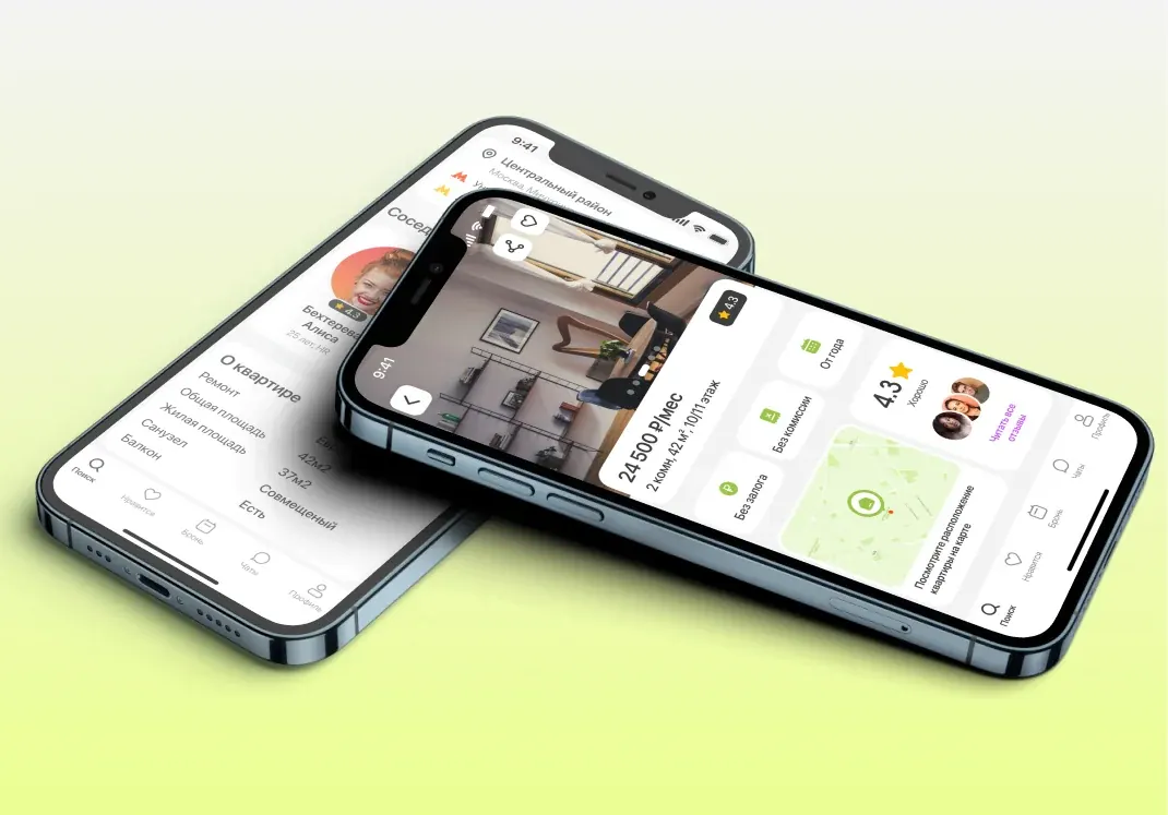
Goal
An MVP app for finding flatmates and renting a place together, so housing costs less.
What I found
First I figured out who actually rents together: students, young professionals, freelancers, travellers. I ran interviews and used them to map JTBD and a CJM. Then I compared CIAN, Avito, Yandex Arenda and Apart Sharing across ~180 features and assessed how much each one matters to the user. That's how the MVP scope came together.
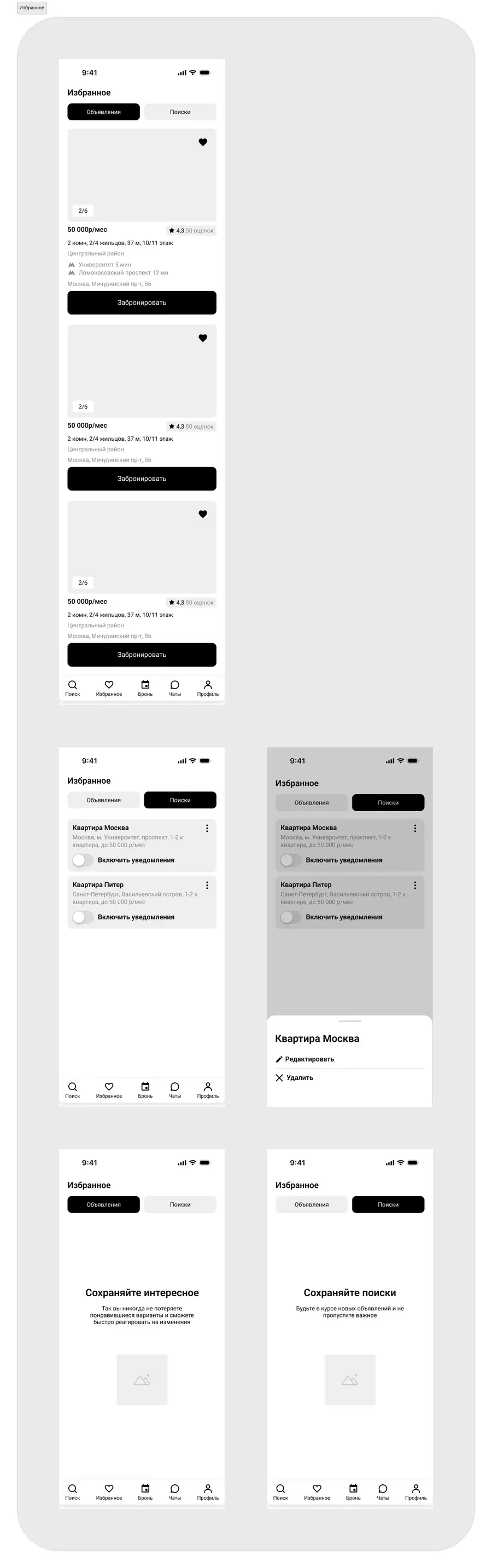
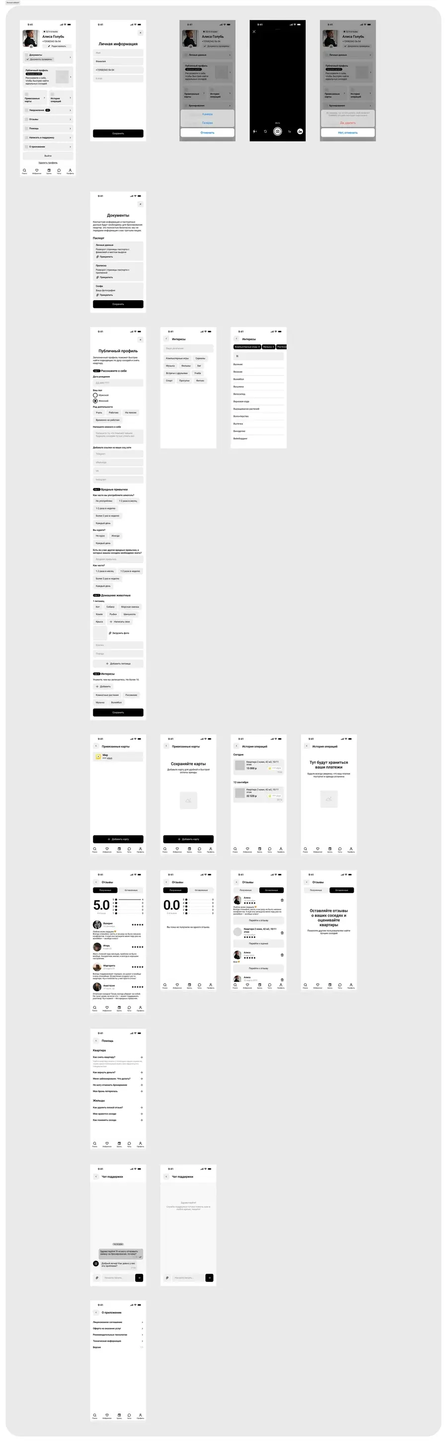
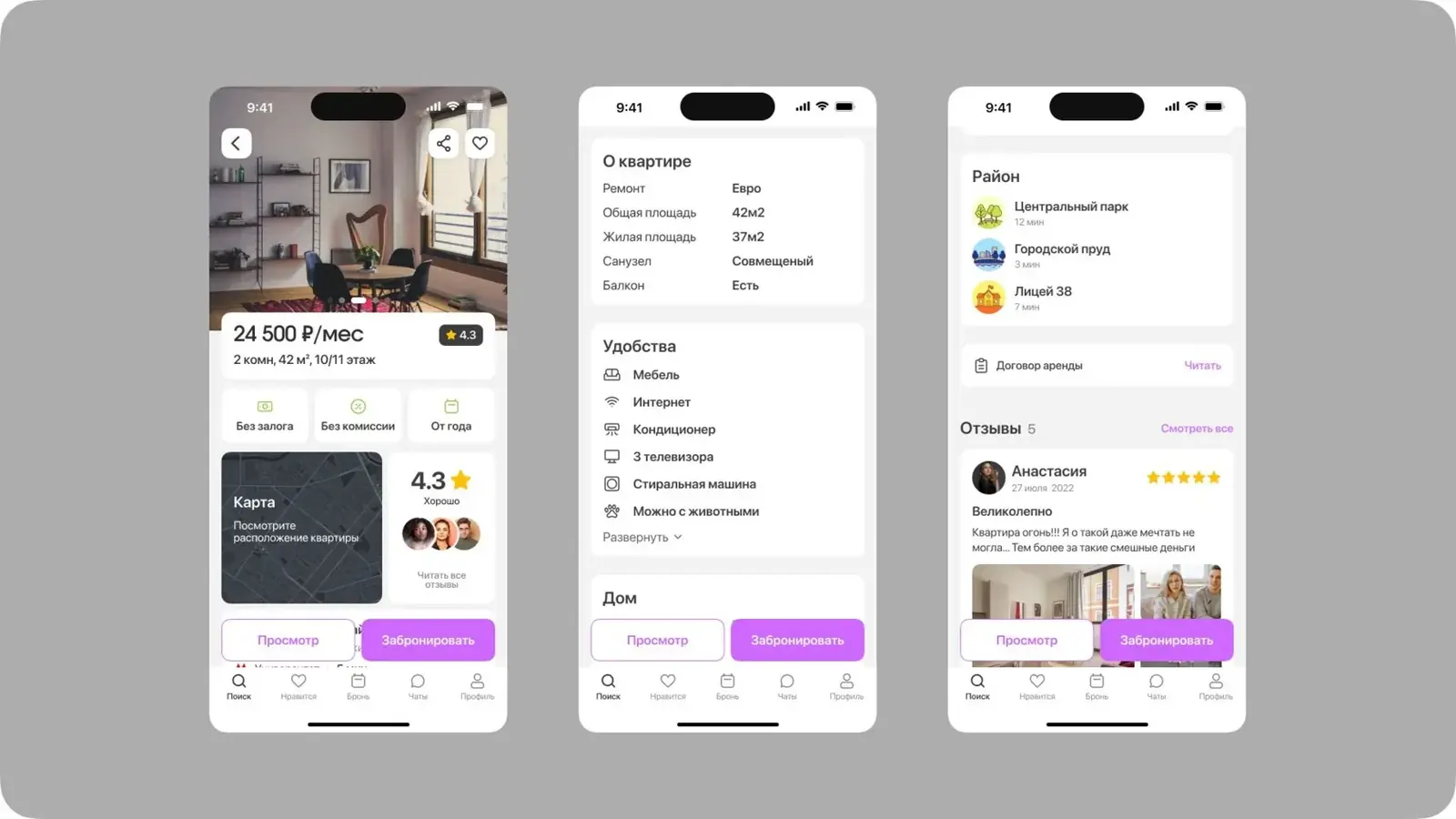
- People fear scams and fake listings. So listings are verified, you can add documents to your profile, and landlords and flatmates have ratings.
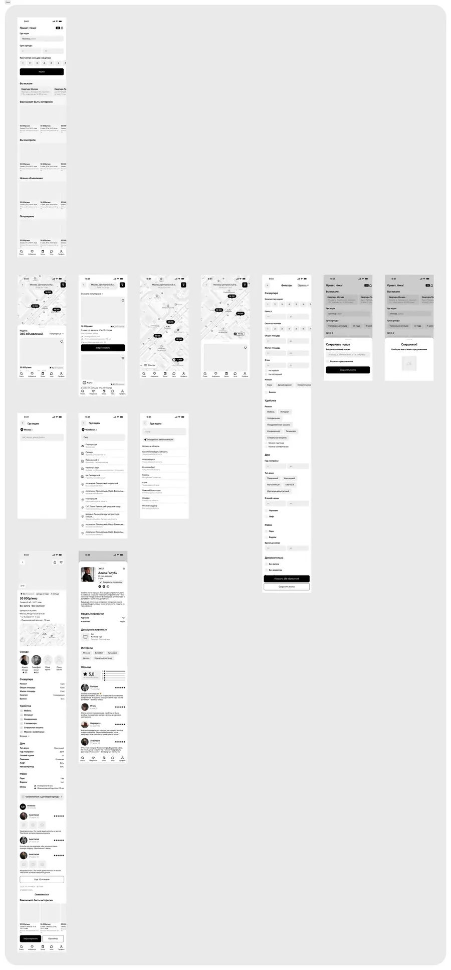
- Flatmates matter as much as price. Students and young professionals care who they'll live with, so every flatmate has a page with their interests, habits and reviews.
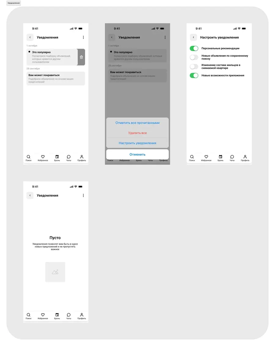
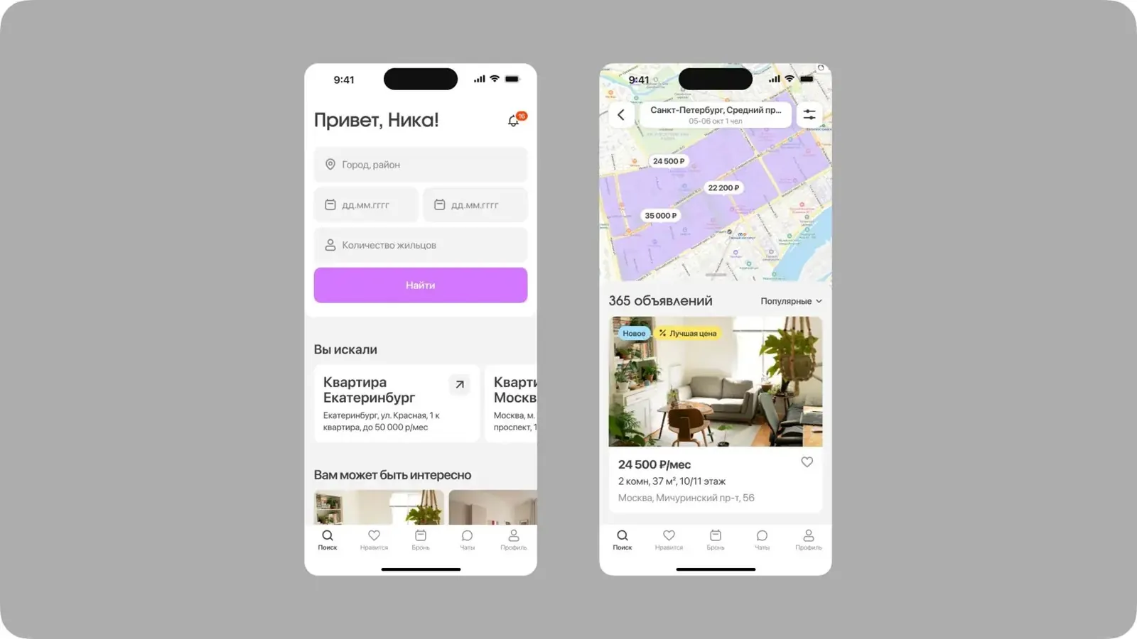
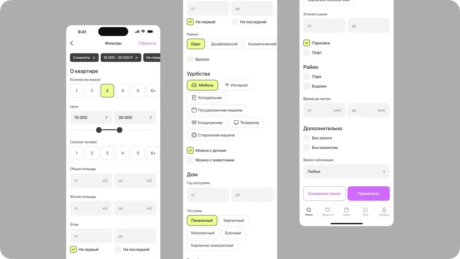
- They search with filters and a map, but get tired of pointless notifications. I designed map search, saved filters and notifications only about new matching flats.
- Travellers care less about flatmates and more about the rental term. So the rental term can be set flexibly in the filters.
Prototyping
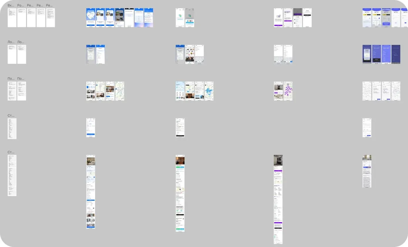
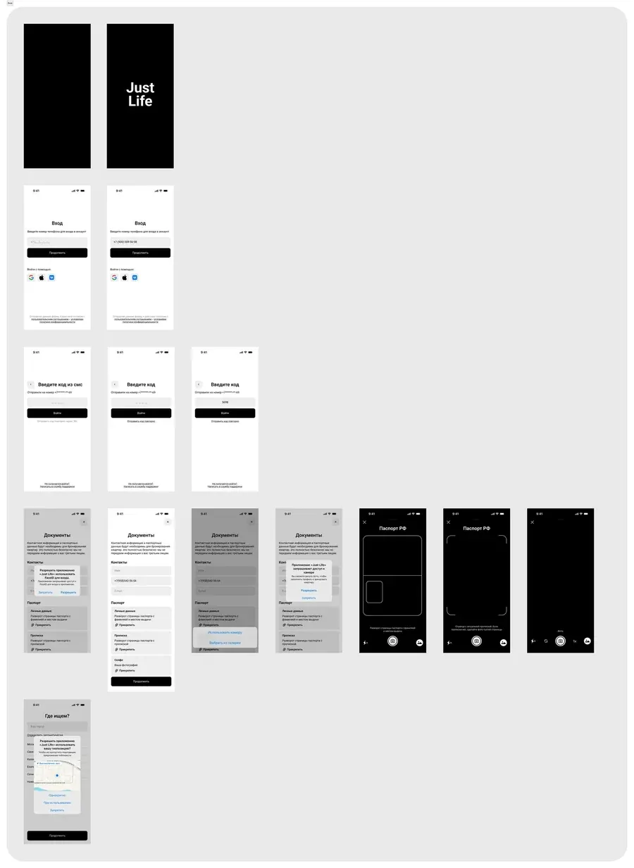
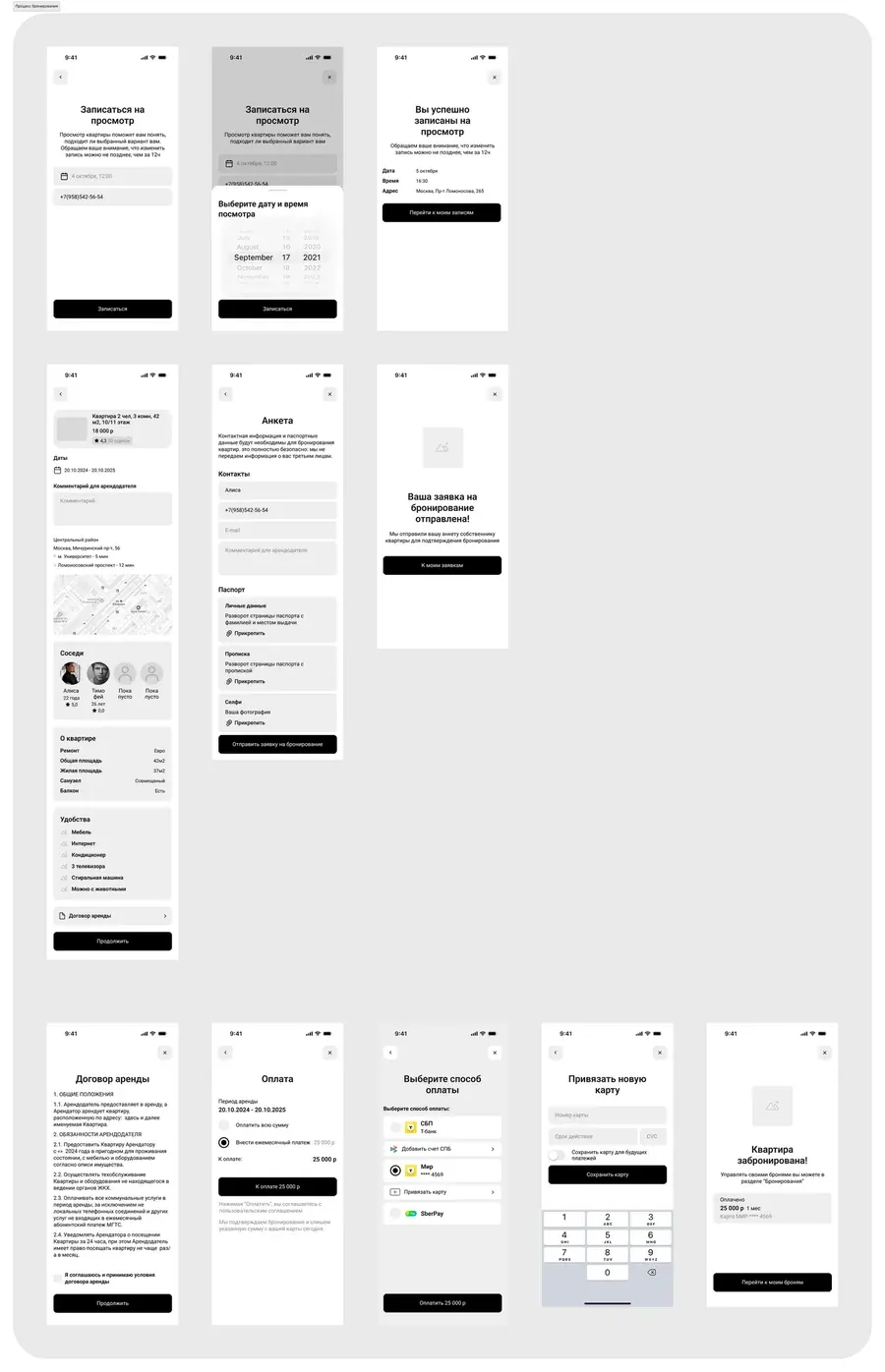
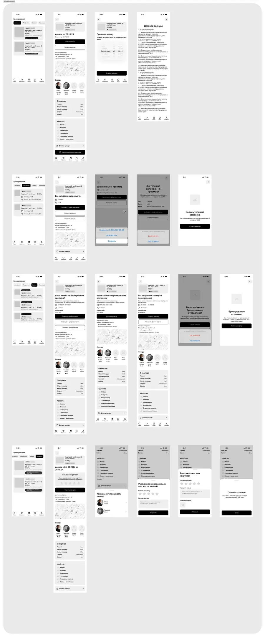
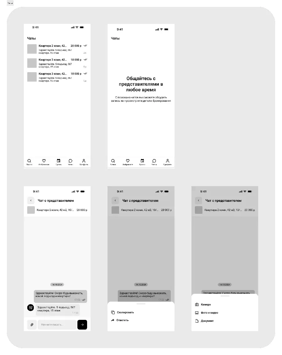
First I put together the architecture, then drew wireframes of every state and built an interactive prototype of the main flows. That came to about 100 screens across 7 sections: sign-in, search, favourites, notifications, profile, booking and booking history.
Visual design
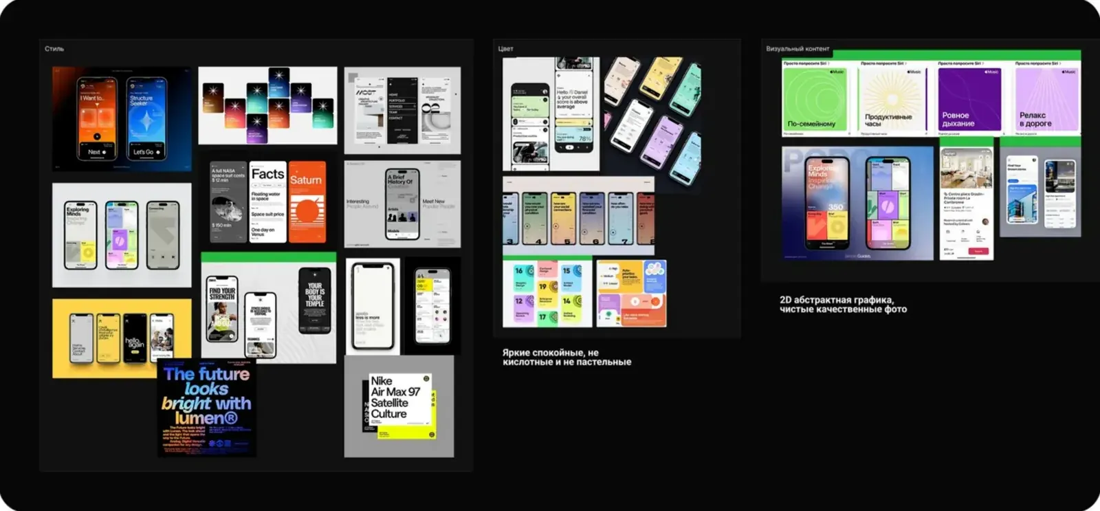
I wanted the app to feel bright and friendly: living together in a beautiful flat is fun, and the interface should get that across. The visuals follow the iOS guidelines.
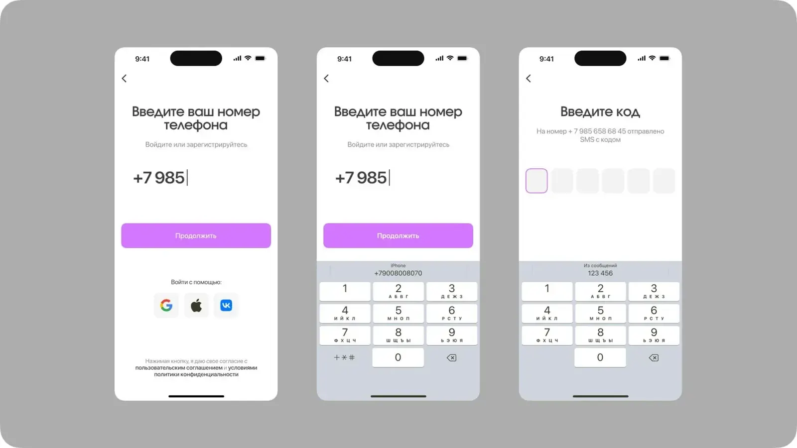
I started with a concept on the key screens: sign-in, search, filters and the flat card.
Result
- An MVP of 7 sections, about 100 screens.
- An interactive prototype of the main flows.
- A project design system.