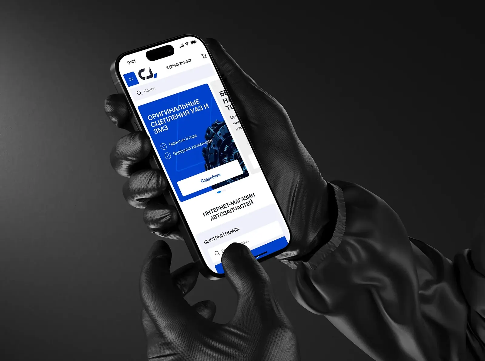
An online store for 60,000+ truck parts
About the project
Service Center-3 sells truck parts in Tatarstan: KAMAZ, ZIL, URAL, MAZ, KRAZ, more than 60,000 items and delivery across Russia. The old site was just a catalogue, and the task was to turn it into an online store with online ordering.
Who buys. Anyone who needs truck parts: repair shops, fleets, private drivers. Some know the exact part number, others search by make and model. What everyone needs is to find the part quickly, check stock and pick it up from the nearest warehouse or order delivery.
My role. I led UX/UI from the audit to the developer handoff, working with the SEO specialist, the project manager and front-end and back-end developers.
Structure
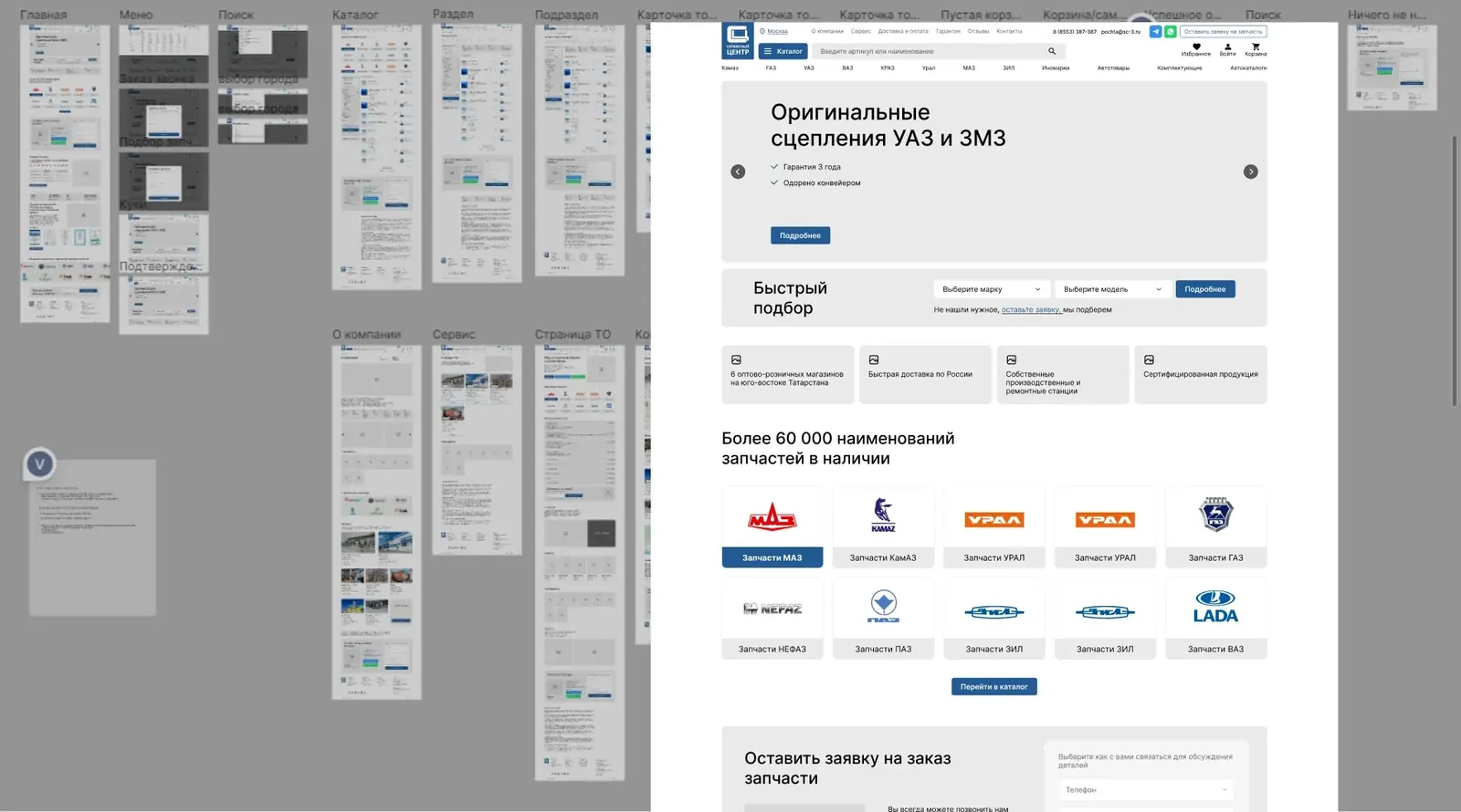
According to the SEO specialist, people often left the site: the old interface couldn't handle a complex product structure, there were no photos and analogues got mixed up. Based on that data I designed a new architecture for the catalogue and the whole site.
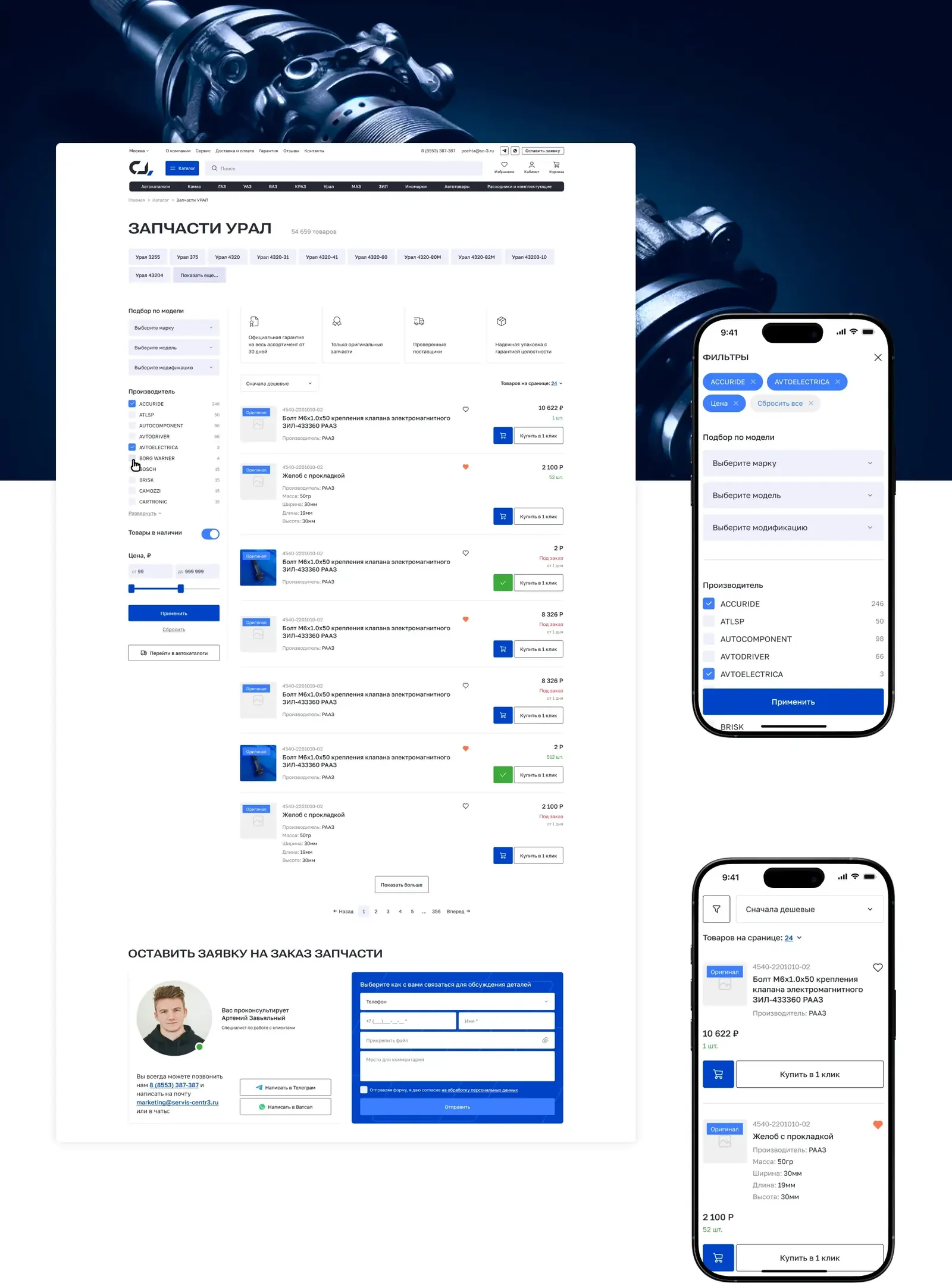
Search and filters
You can't find 60,000 photo-less items by scrolling, so search works on three levels:
- Model lookup: make → model → modification. For people who don't know the part number.
- Quick model chips above the list (Ural 4320, Ural 375…) to narrow results in one click.
- Filters: manufacturer with item counts, "in stock only", price.
If the part isn't found, you can send a request with a photo or file right from the catalogue.
A catalogue without photos
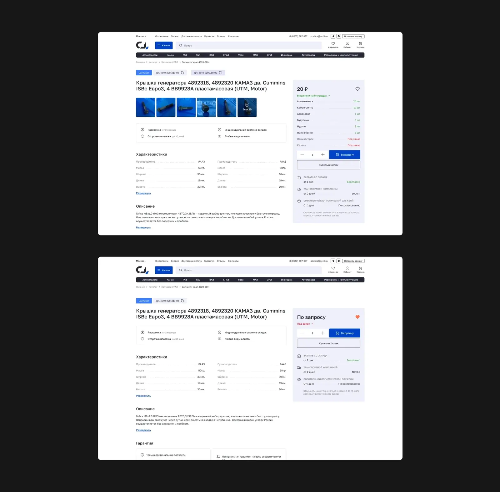
90% of the items come from 1C without photos. In a regular grid the catalogue would look broken, so I made a horizontal card built around the part number, name and specs. The weight moved from the image to the data.
Warehouses and delivery
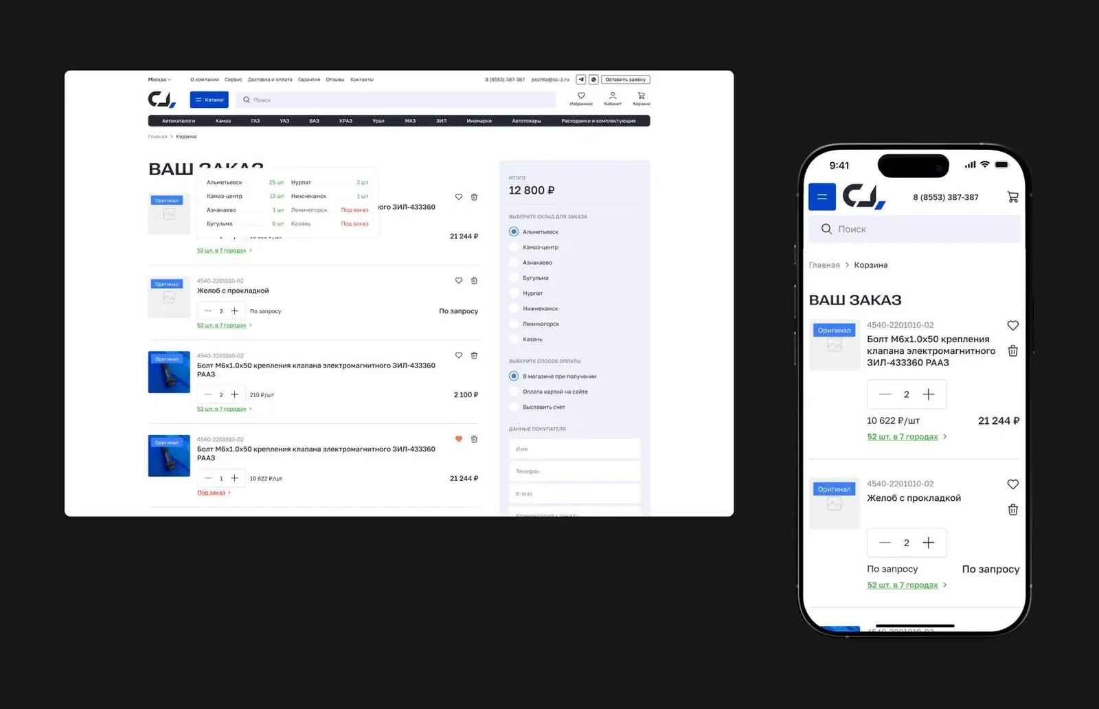
Items sit in different warehouses, and the buyer chooses pickup or delivery from a specific location. The cart got a block with stock and warehouse choice: more complex logic, but clearer for the buyer and easier for logistics.
Mobile version
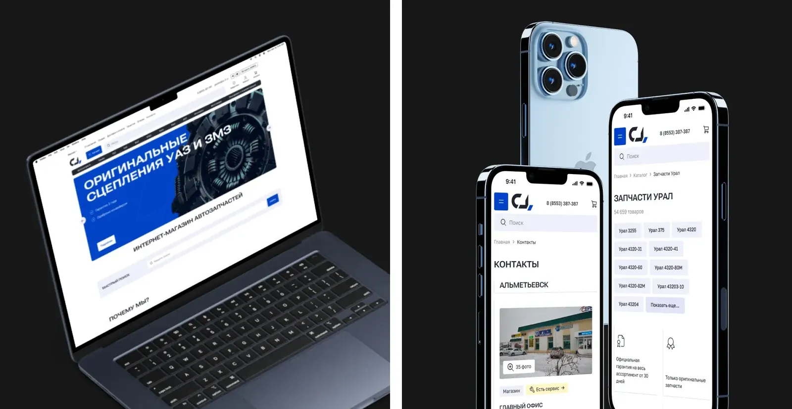
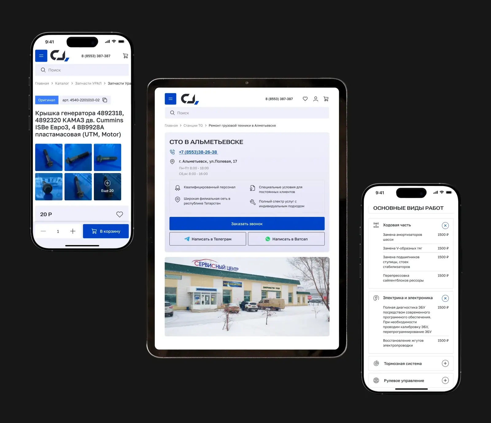
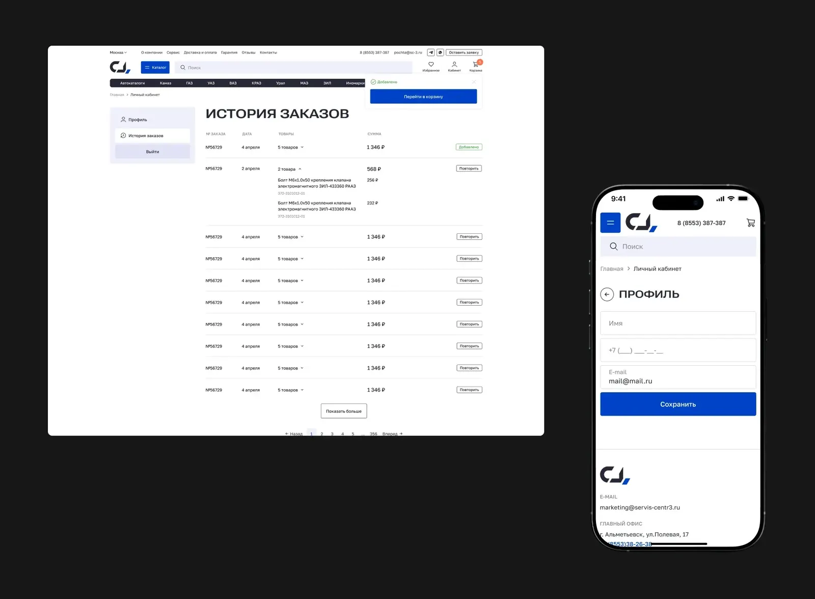
Every desktop flow works on the phone: filters open full-screen, selected ones show as chips at the top and reset with one button, the list has sorting and "Buy in 1 click", and spec tables collapse.
Result
- The site is live: sc-3.ru.
- A catalogue of 60,000+ photo-less items, model lookup, a cart with warehouse choice.
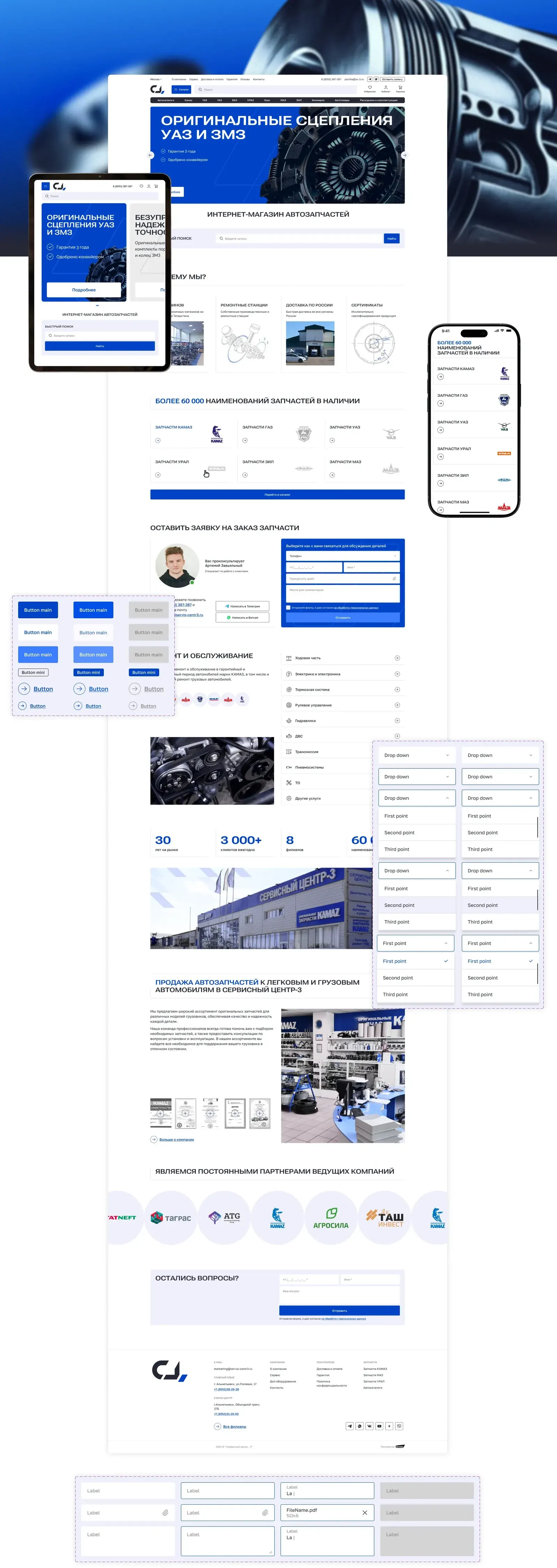
- The visual style is "industrial minimalism": nothing extra, the focus on data.
- A UI kit for development and maintenance; designs handed off with documentation on animation and states.
What we aimed for: more online orders instead of calls, more search traffic thanks to the new catalogue structure, and fewer "is it in stock?" calls.